How Rebuilding Bluelearn's Discussions Feature Increased Time Spent by 32%
Bluelearn is one of India's largest student communities, serving 250K+ users across learning, networking, and career opportunities. The platform had a discussions feature where students could share thoughts and interact with peers. But engagement was falling.
TL;DR
- The problem: Discussions worked like a group chat, not a knowledge-sharing platform. No threading, no upvotes, no way to surface quality content, and no personalization meant the feed felt noisy and irrelevant. Engagement was declining.
- What I did: Redesigned the entire discussions experience end-to-end on mobile, from the feed architecture and post types to the comment system, clubs, follow logic, and onboarding. Also owned the content seeding strategy ahead of launch.
- The outcome: Average time spent on the discussions tab per day increased by 32%. Post-launch saw a wave of new creators: students starting 100-day challenges, sharing work for feedback, and asking doubts in public for the first time.
Client
Bluelearn
Role
Lead Product Designer
Industry
Education & Community
Type
Mobile app
Context
Bluelearn is one of India's largest student communities, serving 250K+ users across learning, networking, and career opportunities. The platform had a discussions feature where students could share thoughts and interact with peers. But engagement was falling. The signal that triggered the redesign came from the inside. The founder flagged it directly: the feature felt incomplete, and if the team itself didn't find value in using it, there was no reason to expect users would. The PM, founder, and I agreed to investigate before committing to any solution.
The Problem
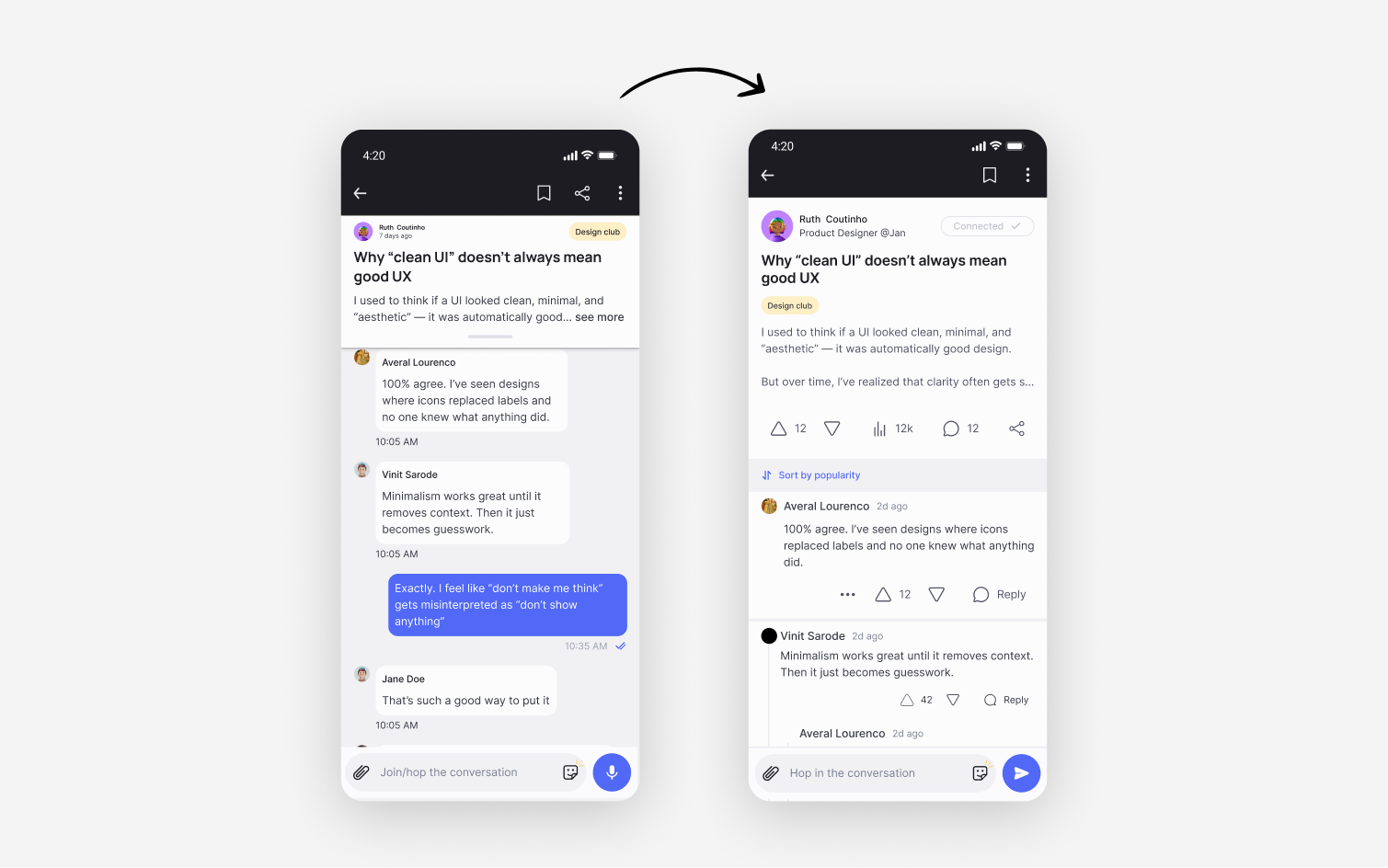
Bluelearn's community discussions feature had the right idea but the wrong execution. A chat-style interface, text-only content, and zero personalization were killing engagement on a platform built for 250K+ students to learn and connect. I redesigned it from the ground up, introducing threaded comments, rich media posts, interest-based clubs, and an intentional content strategy. Average time spent on the discussions tab increased by 32%.
My Role
I owned the full redesign end-to-end on mobile. This covered:
- Feed architecture and post card design
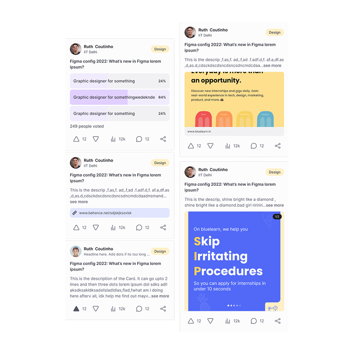
- Four new content types: text, text with images or video, text with links, and polls
- Threaded comment system with upvotes and nested replies
- Clubs and follow logic
- Personalized onboarding to capture interest signals upfront
- Supporting changes to user profiles and connections to enable the new social layer
- Content seeding strategy ahead of launch, in partnership with the PM
I worked with PM Jeevapriya, founder Harish, backend lead Kenan, and frontend lead Dave. We ran a "Crazy 8" brainstorming session with the full team before moving to design, which helped align everyone on the direction before any wireframes were drawn.
Key Design Decisions
Decision 1:
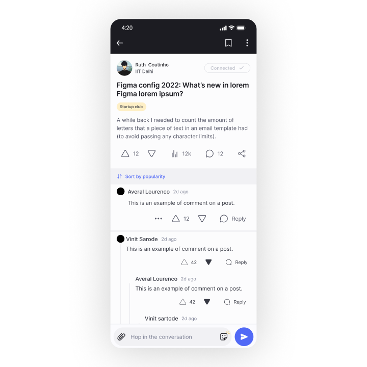
Reddit-style threading with a capped nesting depth
The old group chat interface was the core UX failure. We replaced it with a threaded comment system where the best comments surface at the top by default. But we made a deliberate call to cap nesting at one main comment with two visible replies, with a "see more replies" option below. The reasoning: we weren't confident users wanted endless back-and-forth threads on a student platform. Starting conservative meant we could expand depth later if usage data showed demand. The tech lead confirmed this was feasible to increase without a full redesign.
Decision 2:
Four content types, including polls
Expanding beyond text was a straightforward call once the problem was clear. Adding polls was the more considered decision. Polls gave users a low-friction way to share opinions and ask for community input, which lowered the barrier to first-time posting. You don't need to write a long post to participate — you just need a question.
Decision 3:
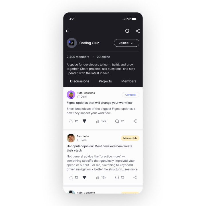
Clubs as the personalization layer
Clubs already existed on the platform but were passive buckets. We made them active through a follow model. Users now select their interest clubs during onboarding, and the feed surfaces content from followed clubs first. This meant the recommendation algorithm could finally use a meaningful signal, and users felt like the platform was built for them rather than everyone. The onboarding change was intentional. Previously, users were shown all clubs by default because the platform was small. With a growing content library, that approach was producing irrelevant feeds. Making club selection intentional during onboarding was the fix.
Decision 4:
Seed the feed before launch
We knew an empty feed would kill the redesign on day one. While development was ongoing, the PM and I analyzed user data for skills, hobbies, and educational backgrounds, then worked with content writers to create 200+ discussion pieces tailored to the platform's actual users. The feed was populated and alive before a single user saw it.
Impact and Outcomes
32%
Average time spent on the discussions tab per day increased by — the team's north star metric for the project
100
Post-launch, the platform saw a wave of new creators: students running days of code" challenges, sharing design work for peer feedback, and asking technical doubts publicly for the first time
200+
content pieces seeded before launch to ensure the feed felt alive from day one
The team participated directly in early discussions to seed quality conversation and ensure questions got answered
Constraints and How I Designed Around Them
Constraint 1: The old discussion data couldn't be migrated
The old chat-based schema was so architecturally different from the new threaded system that migrating all existing discussions would have significantly pushed the timeline. The team was split on this decision. In the end we chose to move forward without a full migration. We kept a small number of high-performing, timeless posts. For everything else, we emailed all affected users to let them know their discussions would be removed, and offered to send them a full list of their content if they wanted to keep it. It was the right call for the timeline, and the honest lesson is that a redesign at this scale should account for data continuity planning far earlier in the process — not as a problem to solve during handoff.
Constraint 2: A new social layer had to be built alongside the redesign
The discussions redesign revealed a gap in the product: users had no way to follow each other or build connections, which meant discussions happened between strangers with no social context. We added a connections and follow system as a supporting feature. What started as a discussion interface redesign ended up touching onboarding, profiles, and the core social graph. This was a useful signal about how interconnected features become as a product matures. Changing one thing at scale always moves other things.
Learnings
Redesigns create ripple effects you don't fully anticipate.
This project began as a discussion interface redesign and ended up requiring changes to onboarding, profiles, connections, and the content algorithm. As products grow, features stop being independent. Changing one surface at scale always moves other things. The lesson is to map dependencies early, not discover them mid-build.
Data continuity should be in the design brief from day one.
The migration decision was the hardest call on this project. We made the right call for the timeline, but the honest learning is that we should have asked the data question earlier: what happens to existing content when we ship this? That's a product design question, not just an engineering one.
Empty states are a product strategy decision, not a UI detail.
We seeded 200+ pieces of content before launch because we knew an empty feed would undermine everything else. That decision was as important as any interface choice we made. A well-designed feature with no content to show is still a failed feature.


