How Redesigning the Chat Screen Increased Recruiter-Candidate Match Rates by 38%
Bluelearn is a hiring platform serving 250K+ users, connecting students with recruiters across full-time, internship, freelance, and part-time roles. The hiring flow was straightforward: recruiters browse candidate profiles, like someone, send a message. Candidates do the same from their side.
TL;DR
- The problem: Recruiters messaging candidates had zero context without leaving chat. Candidates sent generic "hi" messages that told recruiters nothing about their fit.
- What I did: Redesigned the chat screen for both recruiters and candidates across web and mobile — embedding candidate profiles, adding one-click action buttons for recruiters, and nudging candidates toward thoughtful introductions.
- The outcome: 38% increase in match rates. 41% increase in message initiation.
Client
Bluelearn
Role
Lead Product Designer
Industry
Education & Career Development
Type
Web & Mobile App
Context
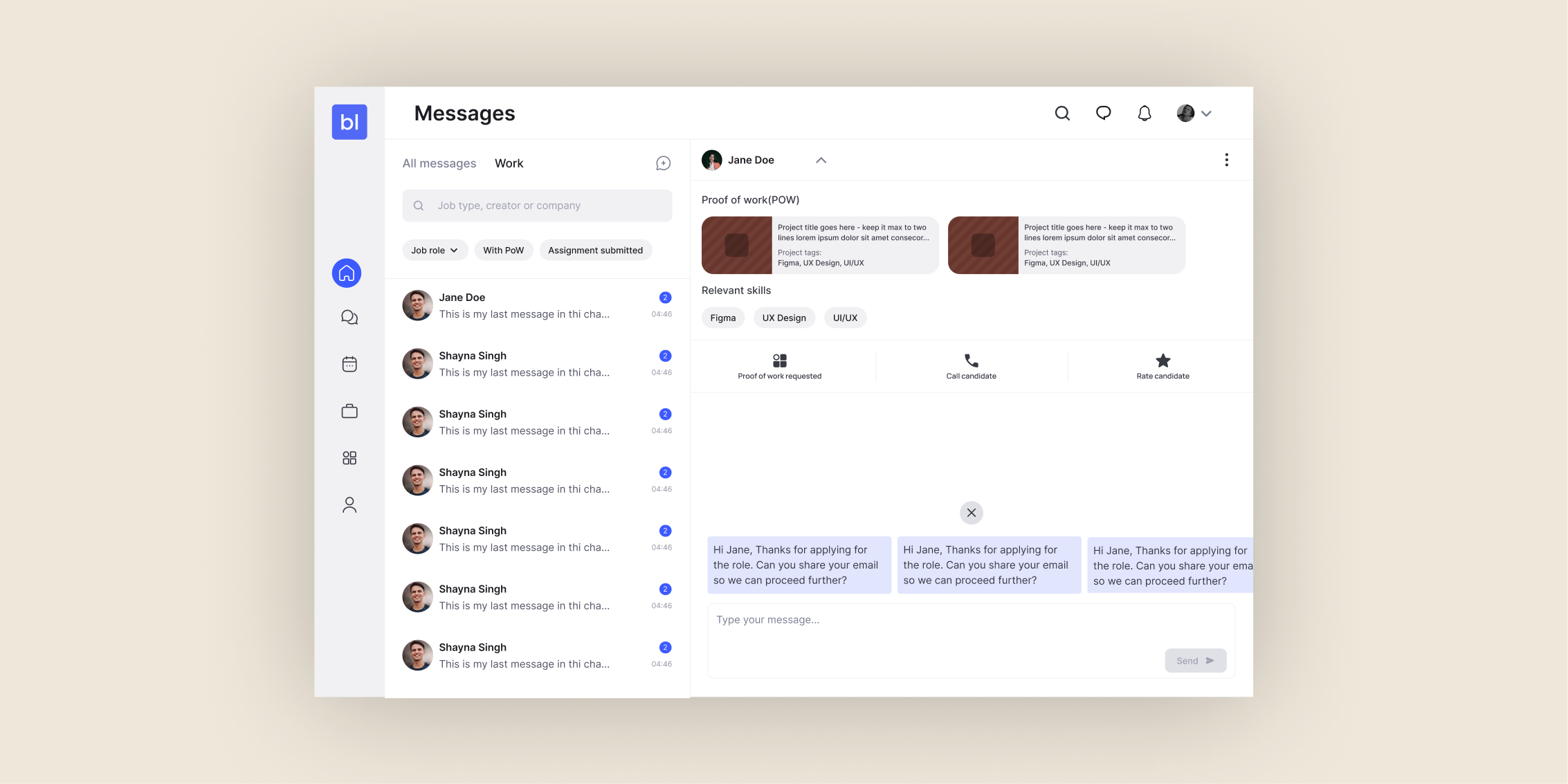
Bluelearn is a hiring platform serving 250K+ users, connecting students with recruiters across full-time, internship, freelance, and part-time roles. The hiring flow was straightforward: recruiters browse candidate profiles, like someone, send a message. Candidates do the same from their side. But the moment both sides reached the messaging screen, they hit a wall. The chat was just message bubbles. No profile context. No structured way to request information. No guidance for candidates on how to introduce themselves. This was a hiring platform behaving like a generic social messaging app.
The Problem
Bluelearn's messaging experience was a generic chat interface on a platform built for hiring. Recruiters had no context about who they were talking to. Candidates sent one-word greetings that revealed nothing. I redesigned the chat screen end-to-end across web and mobile, embedding candidate context and one-click recruiter actions directly into the conversation. Match rates increased by 38% and message initiation increased by 41%.
My Role
I owned the chat screen redesign end-to-end across web and mobile. This included:
- Information architecture of what context and actions needed to live on the chat screen
- Progressive disclosure logic for the candidate profile card
- Design of the one-click action buttons for recruiters
- Message nudge system for candidates
- Edge case handling for candidates applying to multiple roles from the same recruiter
The broader chat experience (message bubbles, read receipts, delivery states) stayed consistent with the rest of the app. This redesign only activates when a user is in a hiring conversation — applying for a specific role and messaging the other party directly.
Key Design Decisions
Decision 1:
Embed candidate context directly into the chat screen
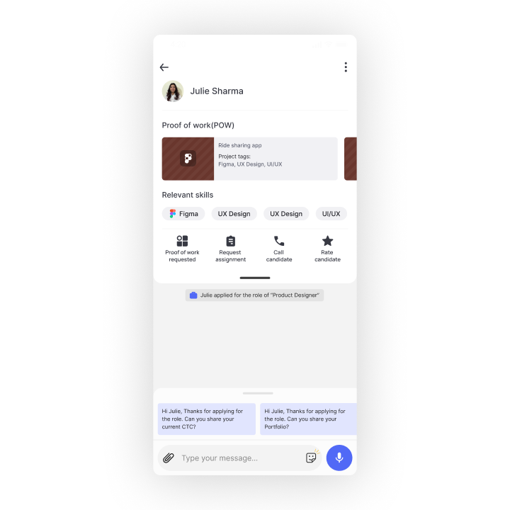
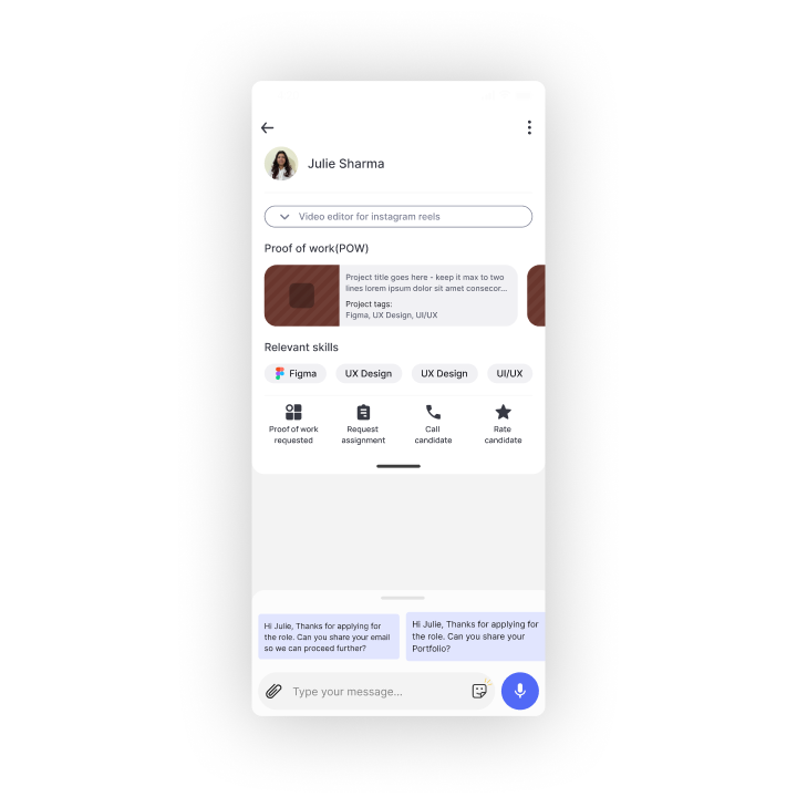
On a platform where hiring depends on conversation, recruiters need candidate context without leaving chat. Sending them to a separate profile screen breaks the flow and forces mobile users to juggle two screens. I embedded the profile card at the top of the chat so recruiters could see skills, projects, and key info without ever leaving the conversation.
Decision 2:
Progressive disclosure — expand on first view, collapse on return visits
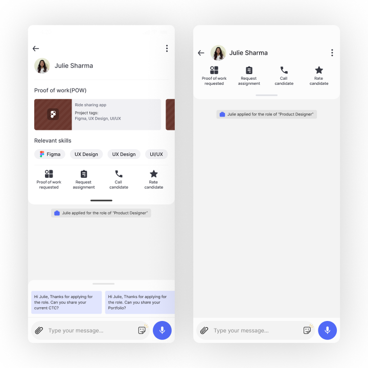
The hardest design tradeoff was keeping the chat lightweight while making candidate context visible. A permanently open profile card would push the message thread down and overwhelm the screen. I designed the card to expand on the first visit so users understand what information is available. On subsequent visits, it collapses to a minimal header showing just the candidate's name and role. One tap reopens it if needed.
Decision 3:
One-click action buttons for recruiters only
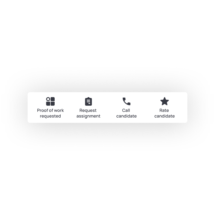
Recruiters were typing the same requests repeatedly: send me your email, what's your availability, can you complete this assignment. I added templated one-click buttons so recruiters could request email, phone number, or send an assignment in a single tap. The action buttons lived only on the recruiter side so candidates' first messages remained a signal of how they communicate.
Decision 4:
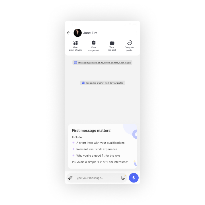
Nudge candidates, don't template them
Instead of templates, candidates got nudges. When composing a first message, they saw guidance like "mention what makes you a good fit for this role" or "avoid generic greetings like hi or hello." This pushed them toward stronger communication without dictating what to write, preserving their natural voice as a key signal for recruiters.
Decision 5:
Surface the job role in chat for multi-role conversations
On Bluelearn, a candidate might apply to multiple roles from one recruiter, or a recruiter might be hiring for several positions simultaneously. Without context, conversations about different roles blur together. I surfaced the specific job role prominently on the chat screen so both sides always knew which position the conversation was about.
Impact and Outcomes
38%
increase in recruiter-candidate match rates
41%
increase in message initiation
250K+
Users served by the platform at the time of launch
Recruiters could conduct complete hiring conversations without leaving chat
Candidate message quality improved through nudge-driven guidance
Constraints and How I Designed Around Them
The chat experience had to stay consistent with the rest of the app
The broader Bluelearn app uses the same messaging interface across all contexts. We couldn't redesign chat globally — it would break too many other flows. The hiring-specific experience had to layer on top of the existing interface, only activating when the user is in a job application context. This meant every addition had to feel like a natural extension of the existing UI, not a separate product bolted on.
The profile card couldn't slow down the chat loading
On mobile, profile data didn't always load instantly. If the embedded card appeared empty for even a few seconds, the chat would feel broken. I designed the card to load progressively and degrade gracefully — showing basic information first, populating richer details as they loaded in.
Learnings
Asymmetric design for asymmetric roles
Recruiters and candidates have completely different needs in the same conversation. Recruiters need efficiency and context. Candidates need to make a strong first impression. The same solution — templates for both sides — would have served neither well. Designing asymmetrically for each role proved that the best interface for a two-sided platform is rarely the same on both sides.
Progressive disclosure solves the "too much context" problem
Every time I added more recruiter context to the screen, it pushed the conversation down. The expand-on-first-view pattern was the right resolution: give users enough on the first visit to understand what's there, then get out of the way. This pattern is broadly applicable to any interface where context matters but shouldn't dominate.
Nudges work better than templates when the output is itself a signal
For candidates, we debated whether to give them message templates to improve response quality. We decided against it specifically because a candidate's ability to communicate in their own words is part of what a recruiter is evaluating. Templates would have improved surface-level metrics while obscuring the signal recruiters actually care about. Sometimes the right design decision is to not make something easier.