Work / Linkrunner — Marketing Website
Linkrunner — Marketing Website
Designing a marketing website and interaction design for a link management platform.
Problem
Linkrunner needed a marketing website that clearly communicated their value proposition to potential customers. The site needed to explain link management concepts in accessible language and include interactive elements that demonstrated the platform's capabilities.
Client
Linkrunner
Role
Product Designer
Industry
Marketing Technology
Type
Marketing Website
Scope
UX Design, UI Design, Interaction Design, Brand Design
Context
Linkrunner is a link management and analytics platform. The marketing website needed to explain complex link management concepts to potential users and demonstrate the platform's value through interactive elements. The site served marketers, content creators, and businesses who needed to understand what link management could do for them before signing up. Constraints: - Need to explain technical concepts in accessible, benefit-focused language - Interactive elements needed to work smoothly across devices - Competitive market requiring clear differentiation - Responsive design for mobile and desktop
My role
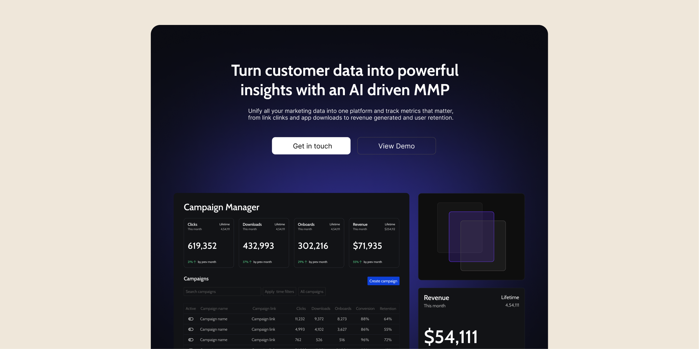
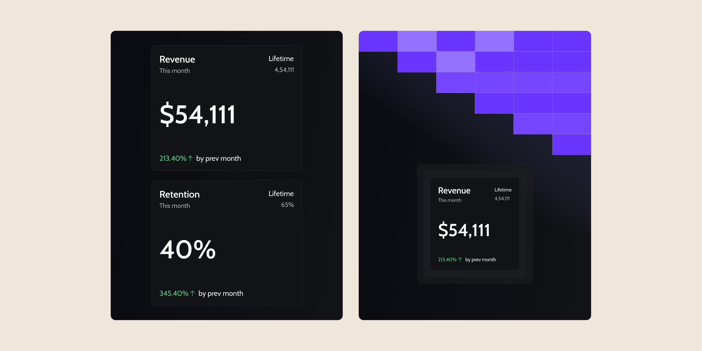
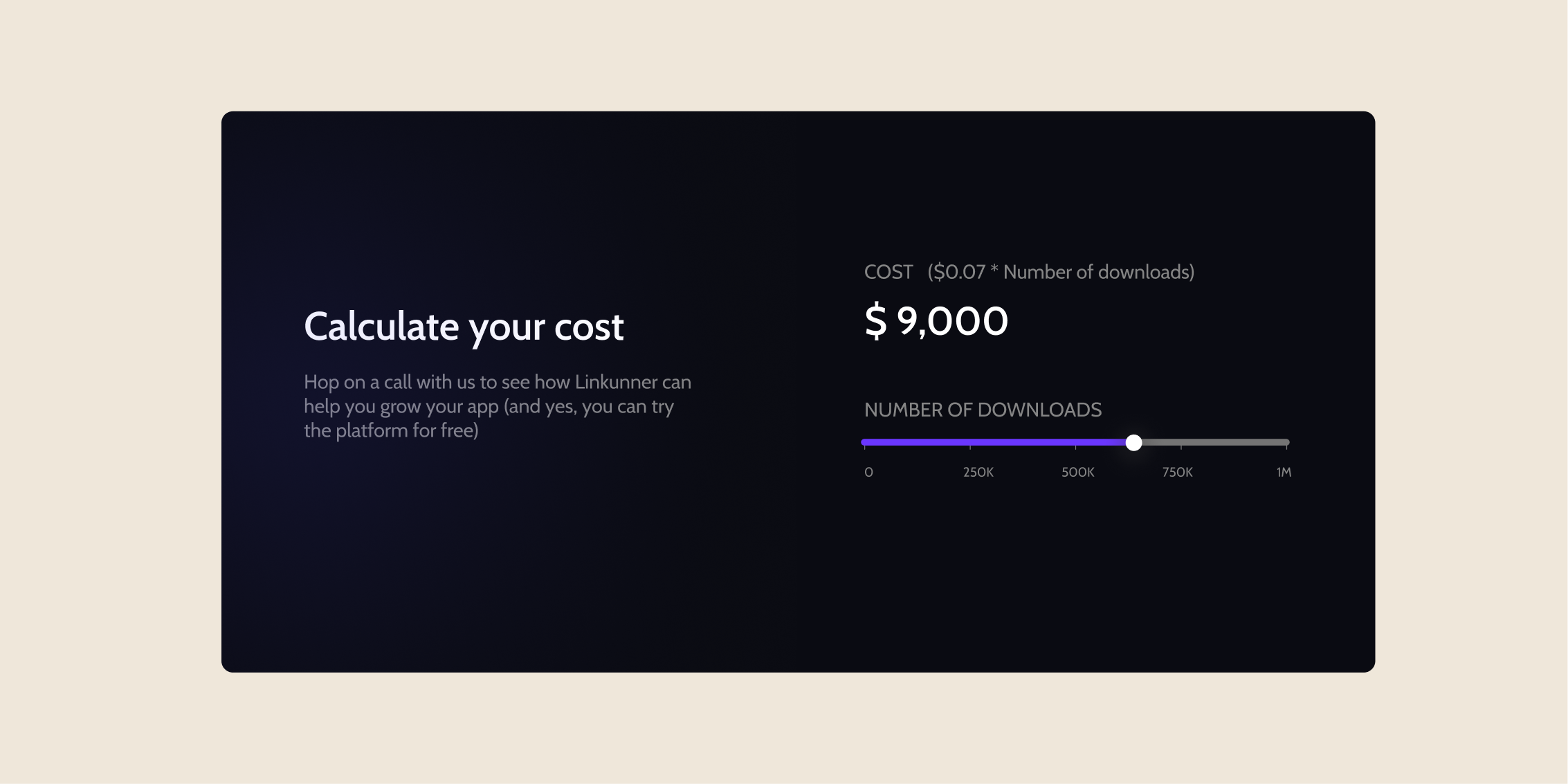
I designed the marketing website structure, landing page architecture, and interaction design. I created the interactive pricing slider and designed how the site would demonstrate link management concepts through visual examples. I designed mockup visuals of what an analytics dashboard could look like for marketing purposes—these were not actual product designs, but visual demonstrations to help potential customers understand the platform's capabilities. I worked with the founder and marketing team on content strategy and with frontend engineers on implementing the interactive elements.
Approach
I researched how potential customers thought about link management and what language resonated with them. Many were confused by technical jargon around link tracking and analytics. Key design decisions: - Structured the landing page to lead with benefits, then explain features through interactive examples - Designed an interactive pricing slider that let visitors explore different plan options - Created dashboard mockup visuals to demonstrate analytics capabilities—these were marketing visuals, not product designs - Used clear, benefit-focused language that avoided technical jargon - Made complex concepts approachable through visual examples and use cases I prioritized clarity and interactivity—the site needed to help visitors understand link management quickly and demonstrate value through interactive elements rather than just describing features.
Key solutions
Landing page architecture and benefit-focused content
I designed the landing page structure to lead with clear benefits ("Track every click, know what works") rather than technical features. Each section focused on solving specific customer problems with visual examples and clear explanations that avoided jargon.
Interactive pricing slider and dashboard mockups
I designed an interactive pricing slider that let visitors explore different plan options and see how features scaled with each tier. I also created dashboard mockup visuals to demonstrate analytics capabilities—these were marketing visuals designed to help potential customers understand what the platform could do, not actual product dashboard designs.
Interaction design for marketing demonstrations
I designed interactive elements throughout the site that demonstrated link management concepts through examples rather than just describing them. These interactions helped visitors understand the platform's value before signing up.
Impact
The marketing website improved conversion rates by helping potential customers understand Linkrunner's value proposition quickly. User testing showed that visitors could explain what the platform did after viewing the homepage, and the interactive elements helped demonstrate capabilities without requiring sign-up. The benefit-focused language and interactive demonstrations helped Linkrunner differentiate in a competitive market by making link management concepts accessible to non-technical audiences.
What I learned
Designing marketing websites requires balancing demonstration with clarity. Interactive elements need to show value without overwhelming visitors, and mockup visuals need to be clearly positioned as demonstrations rather than actual product designs. The interactive pricing slider was effective because it let visitors explore options at their own pace, and the dashboard mockups helped potential customers visualize what analytics could look like. I'd explore more interactive demonstrations that let visitors experience link management concepts directly rather than just reading about them.